
The best learn accounting apps are here: Accounting Flashcards & Lessons, Debits & Credits Game, and the Accounting Quiz Game... But how to make the icons look cool? How can you make anything accounting cool, useful, and succinct. App icons gotta be interesting to push, like, hey "install this" and at the same time I want to present the 3 apps together holistically so the user gets the "Full Accounting Play Package."
So below are various mockups, branding conceptions, and app icons I would really appreciate your feedback on.
It is important to know that even though most may "like" one icon or another... in actuality may actually install another icon for other - even subconscious reasons. So it it is tough and for sure a designer will need clean things up.
The main goal is - A nice clean icon people are excited to download (or can tolerate) and the 3 kinda go together. This is the user appeal to those actually using the product. But... There is another market here, such as institutions and even private companies. So the branding needs good conversions (people who see it, want to click it) but, also be appealing to potential strategic partners.
So it is a great challenge and I am happy to share my iterations here - along with references in case we are discussing over email.
And so... the Accounting Play Branding Images
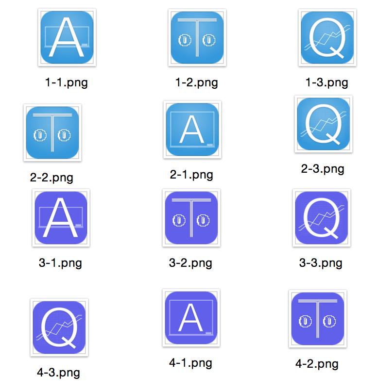
All I need is... 3 core images, 1 Spanish version... 1 Chinese... and a logo for the financial ratios app. So why not just use letters with my logo colors??? Only through crowd feedback, design, and testing - compared to date... will we know the "best" logo.
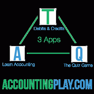
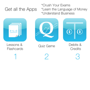
- 2015-11-13 Letter icons and trilogy branding
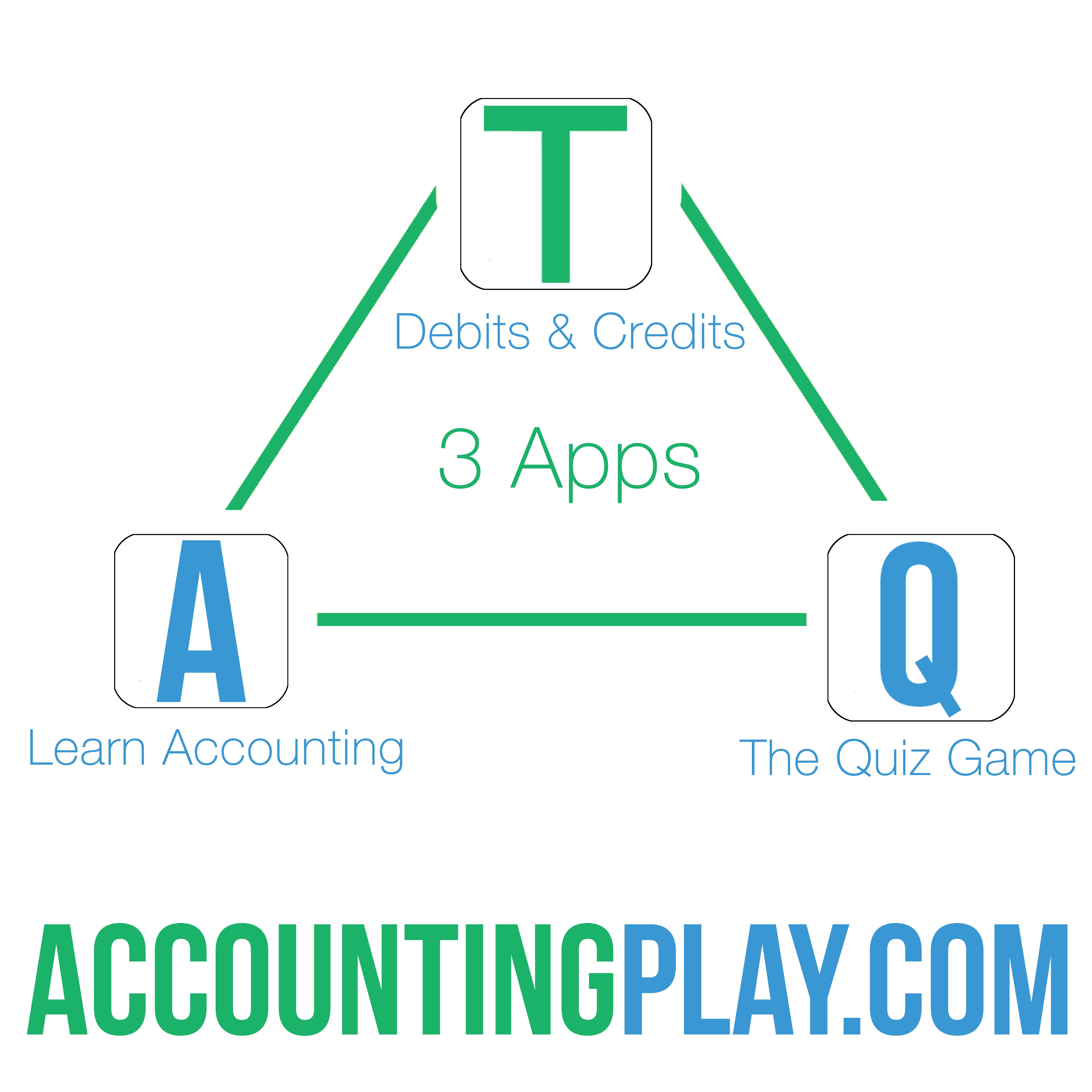
2. Trilogy Together 4k x 4k 10-16-2015
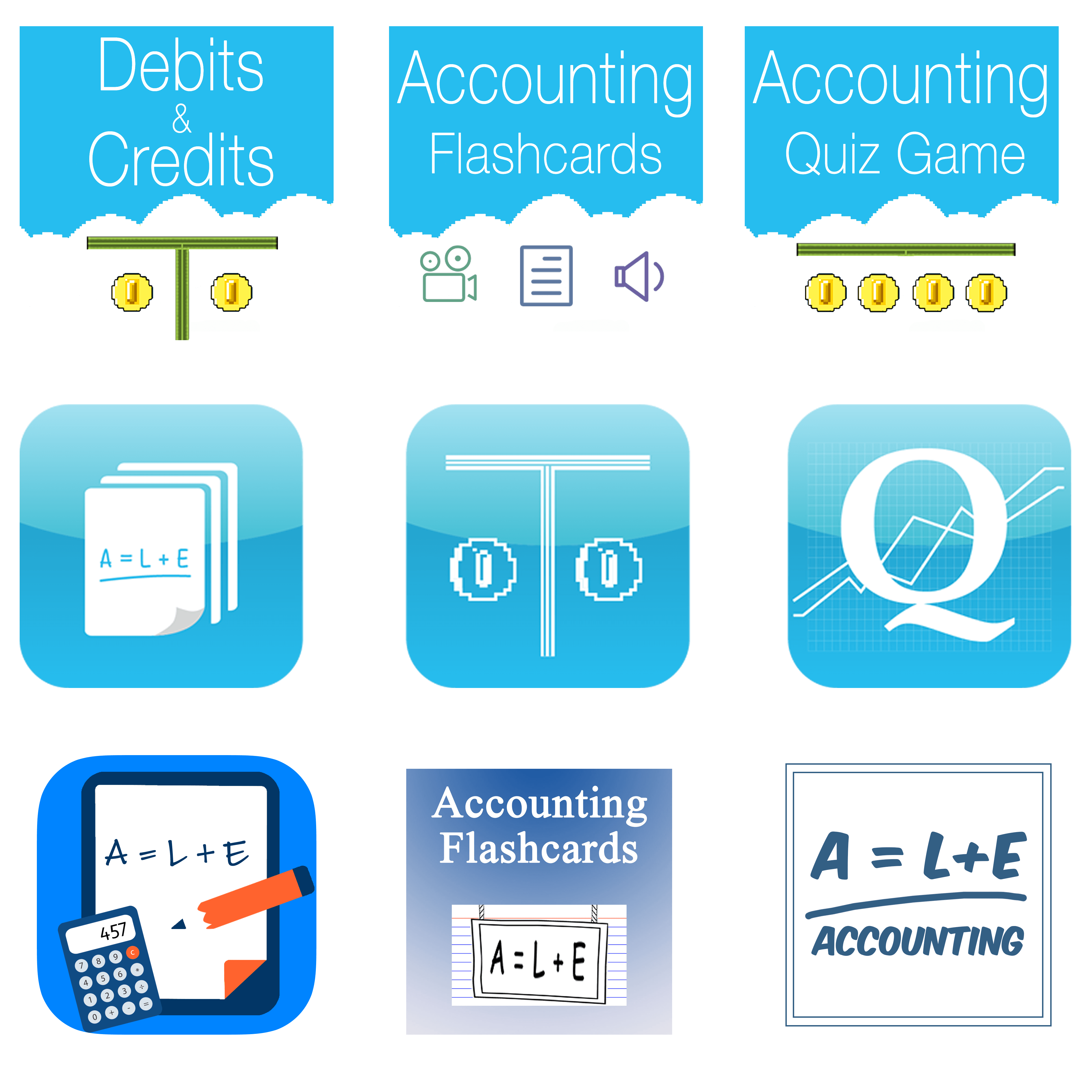
2.1 blue sky, retro 2015 branding - only "Accounting Flashcards" looks significantly different - the hanging flashcard design, circa,
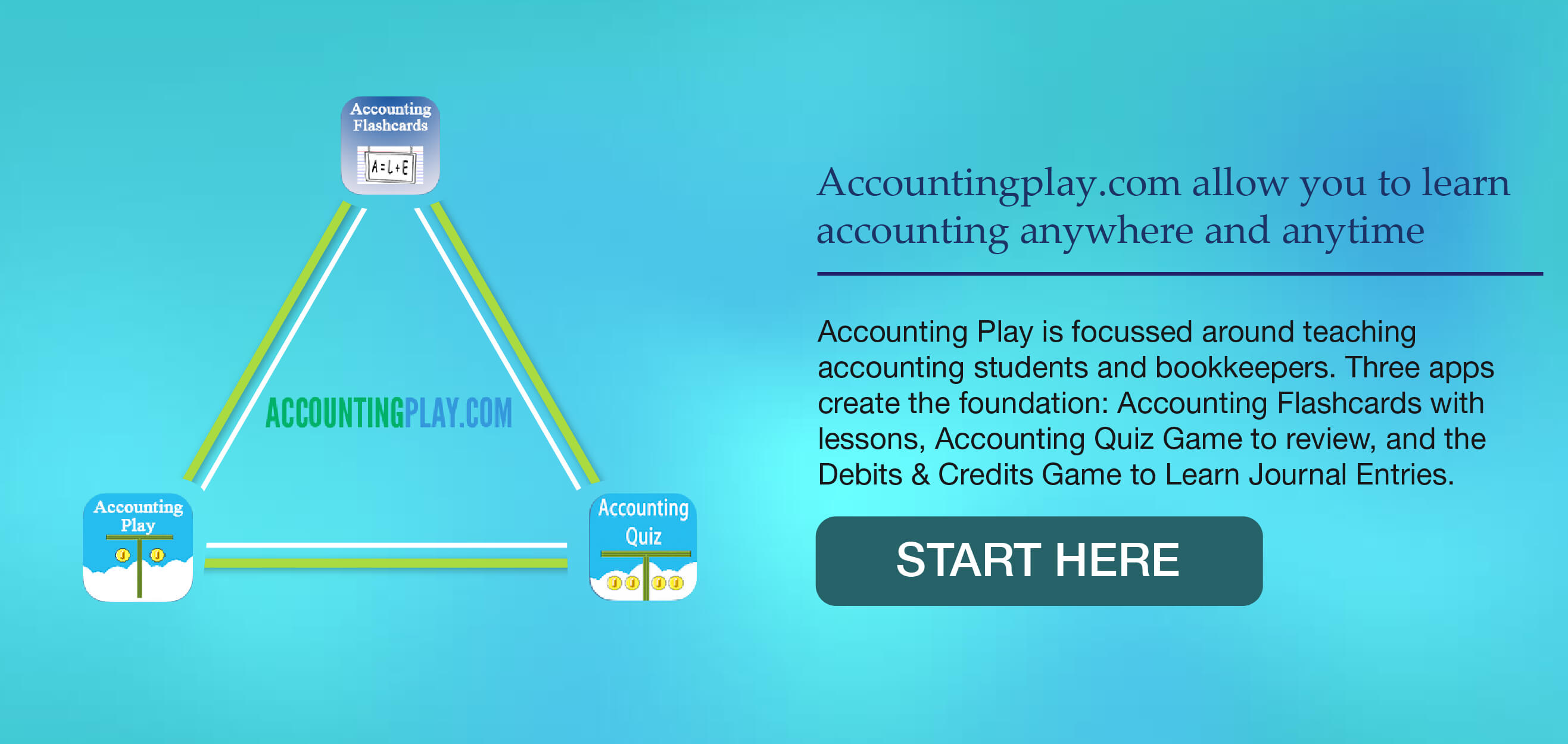
3. 2015-10-18 Horizontal branding
4. 2015-10-29 ipad-splash, s
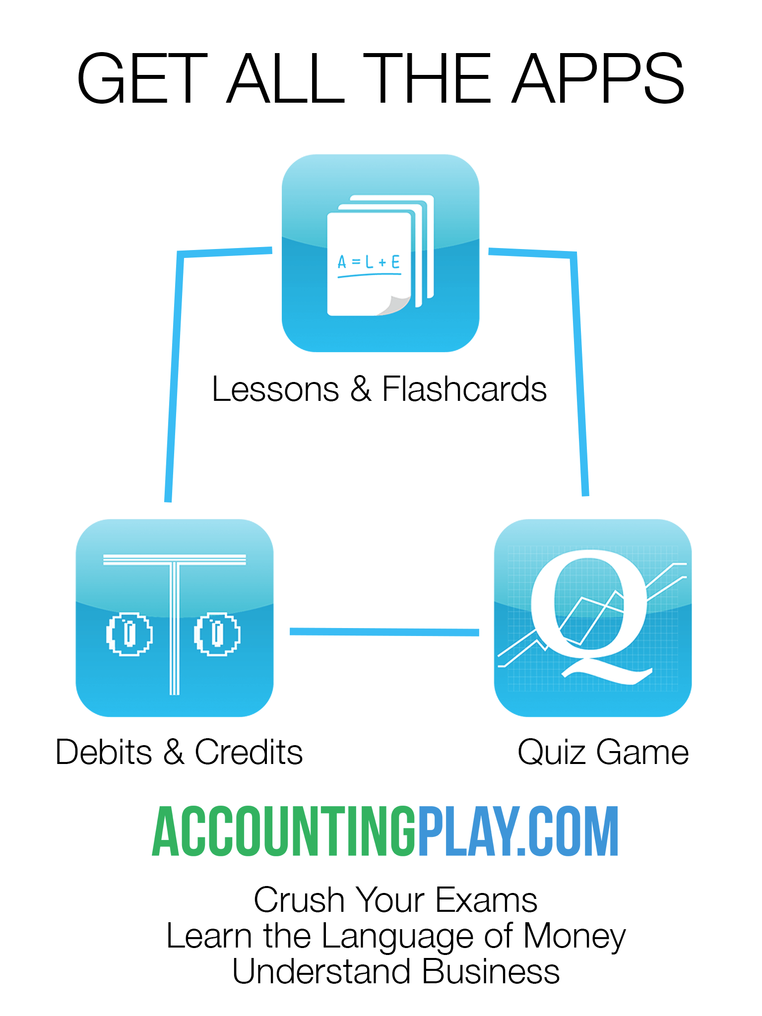
5. 2015-10-13  draft-trilogy_Artboard copy and others
5.1
5.2
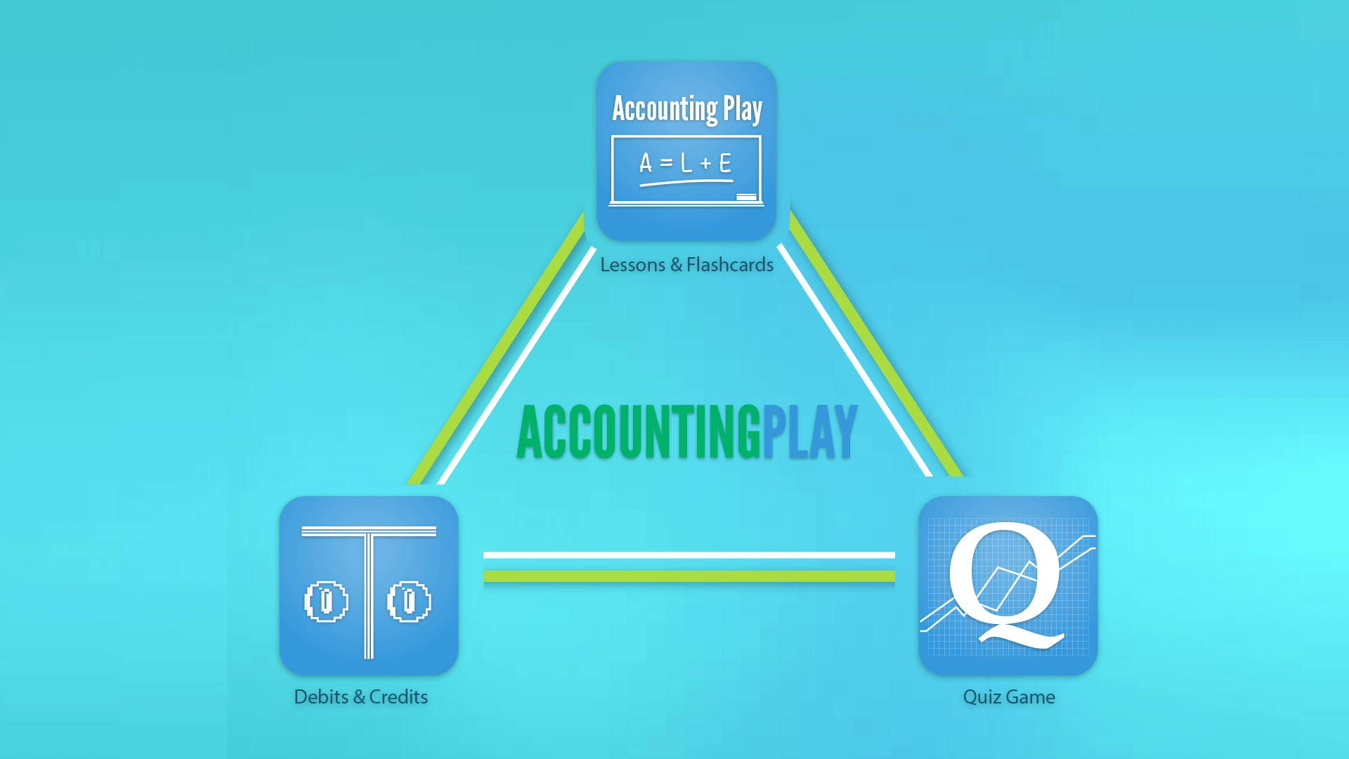
C icons together in triangle format (icons with solid, semi light burst gradient background)
5.3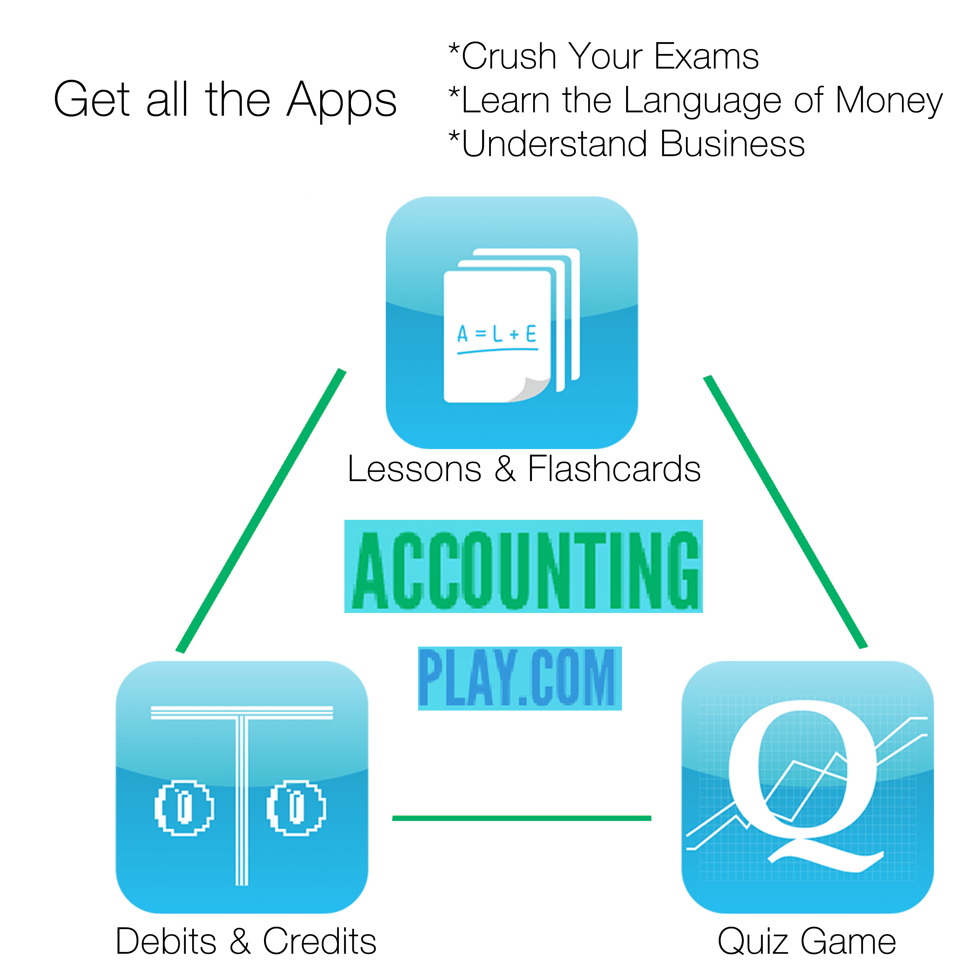
6. 2015-11-13 Logo
![]()
6.1 logo_draft
![]()
7. Logos
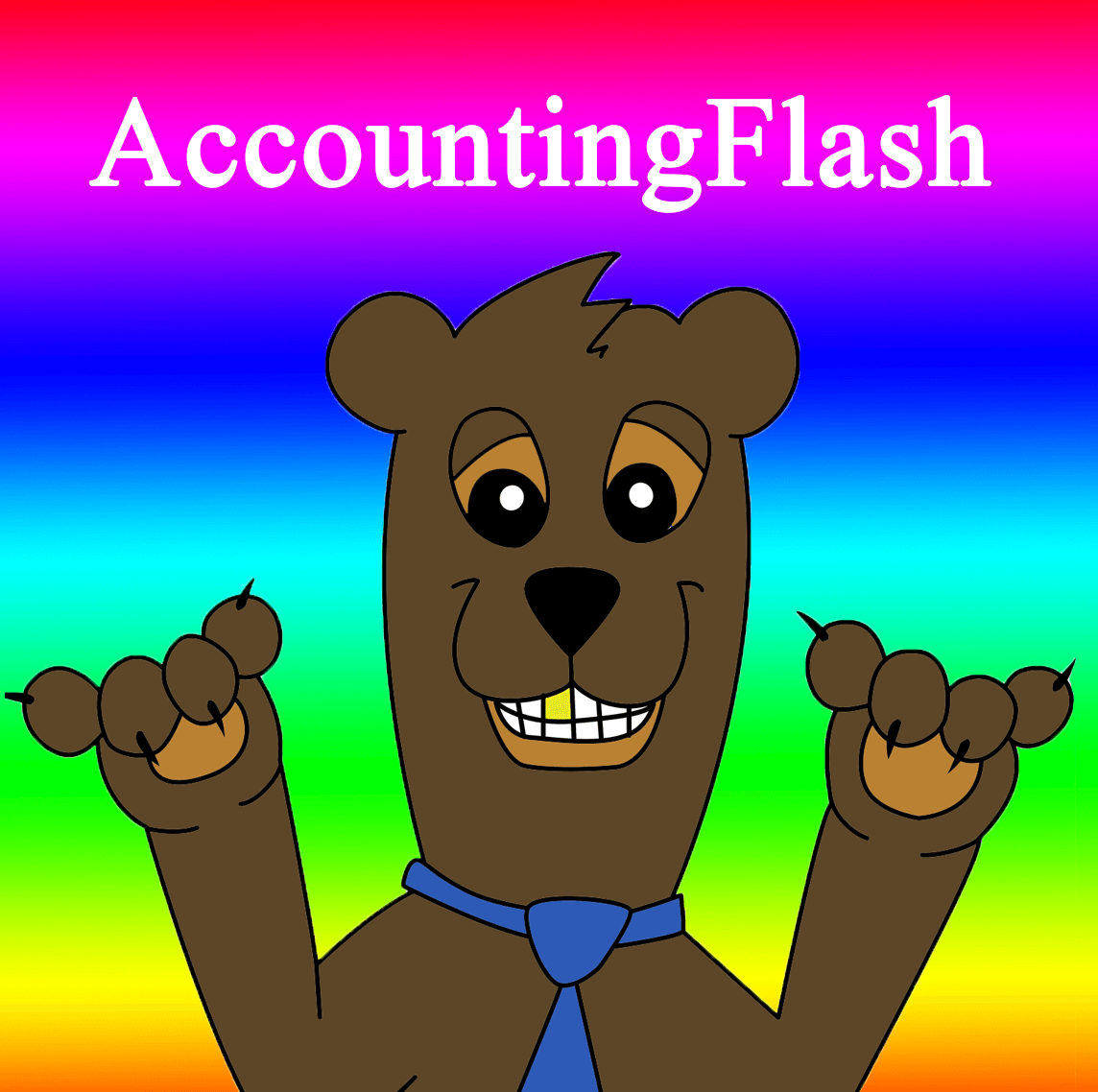
2015-11-2 Podcast logo
![]()
7.1 color beam
7.2 island Page 1 Copy 22

7.3 2014-3-10 Facebook AF I
7.4 social media background : /
![]()
7.5 logo circa 2012...![]()
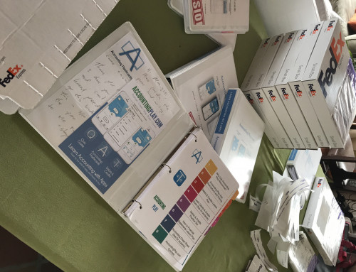
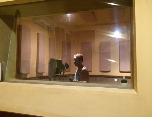
8. To improve 4 sure "me Pics" John pics associated with brand
8.1 JG

8.2 JG - cheesy.

8.3 - other cpa prof image

9.1 Current icons that will need to fit into the 2016 Branding

9.2
9.2.1

9.2.3
Thank you for visiting the History of Accounting Play and making an impact for the future.
Best,
John
Update...
![]()
![]()


Leave A Comment